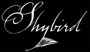
Finishing the latest picture book means a more concentrated effort on Shybird Studio. With colleague Antoine Revoy, the studio is a grand anventure into the animation and motion arts. Here are working sketches of the studio's logo.
4 comments:
Anonymous
said...
Oog like middle logo. Oog think bird look tasty. MMmmmm.
Hmmm... if you want my 2 cents (which I'm not too sure if you do) I am very drawn to either the middle or bottom one. Very smooth and lean lines... and the little birdie has a very mischievous look about him.
I'm liking the first one. The parallel stems of the characters with the half-loop swashes give the name and antiqued dignity. The other two while good, have a flighty(no pun intended), forgetable feel about them.


4 comments:
Oog like middle logo. Oog think bird look tasty. MMmmmm.
Hmmm... if you want my 2 cents (which I'm not too sure if you do) I am very drawn to either the middle or bottom one. Very smooth and lean lines... and the little birdie has a very mischievous look about him.
I'm going to go my own path and say I like the first one best. The second is nice, as well, but we old folk have trouble with them cursive fonts.
I'm liking the first one. The parallel stems of the characters with the half-loop swashes give the name and antiqued dignity. The other two while good, have a flighty(no pun intended), forgetable feel about them.
Post a Comment