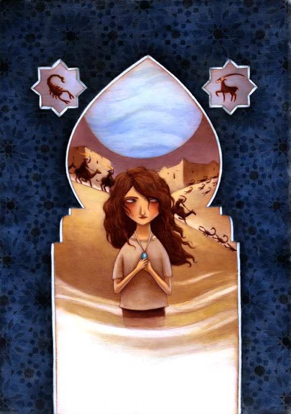
Now, if you've ever talked with me in depth if I ever plan on going "digital", you'll know the response. Sometimes, people assume that I have little experience with the medium, and mayhaps that is the reason why. Honestly... I find the pleasure of mixing my paints, layering the translucency, and then ultimately having the treat of keeping the original painting are only some reasons why I am a stickler for traditional media. BUT! And we all have big buts, using programs to help change my color palettes or easily changing small issues is priceless. For instance, my cover painting for Zahir was a bit too on the dark side, and needed that all important "shelf-pop".

Before
I was also able to dramatically change some of the framing elements, and add more of an emanating glow from the planet in the background.


I will save the final chosen image for a later post. So, I may stand by my brushes till the day I die, but I am very thankful for the easiness of what the digital realm has created.


3 comments:
Wow all of them look great. I know what you mean about going digital though. I'm actually trying to do that myself but there is something about traditional mediums that I just like better. I know the programs decently but i just can't get it to look soft enough. All of the versions look GREAT on this though. THe original is gorgeous. Out of the digital muniplated ones I love the tealish one.
They're all gorgeous, Kelly, but I agree with Samromage: the teal-colored Zahir painting is the most eye-catching of them all. You've done an amazing job balancing the elements without making it look cluttered, and the colors are so striking they draw you right in.
Wow I like them all, even though I prefer the first one "the original"
I love the wall design!
What medium do you use?
Post a Comment